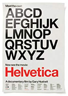
電影訊息
一個字體,一百年的平面設計--Helvetica
演員: Manfred Schulz Massimo Vignelli Rick Poynor Wim Crouwel Matthew Carter Alfred Hoffmann
传奇字体/海维提卡/传奇字体
導演: Gary Hustwit演員: Manfred Schulz Massimo Vignelli Rick Poynor Wim Crouwel Matthew Carter Alfred Hoffmann
電影評論更多影評

2010-05-03 08:38:10
永遠經典永遠現代 The Typeface of Modernism: Helvetica
My Favorite Quotes from Helvetica:
===========================
On Typeface Selection:
-------------------------------
Typefaces express a mood, an atmosphere. They give words a certain coloring.
The sort of classical modernist line on how aware a reader should be of a typeface is that they shouldn't be aware of it at all. It should be this crystal goblet there to just hold and display and organize the information. But I don't think it's really quite as simple as that. I think even if they're not consciously aware of the typeface they're reading, they'll certainly be affected by it, the same way that an actor that's miscast in a role will affect someone's experience of a movie or play that they're watching. They'll still follow the plot, but, you know, be convinced or affected. I think typography is similar to that, where a designer choosing typefaces is essentially a casting director.
On Helvetica:
------------------
A neutral typeface which invites open interpretation and indicates Inherent rightness.
Everywhere you look you see typefaces. But there's one you probably see more than any other one, and that's Helvetica. You know, there it is, and it seems to come from no where. You know, it seems like air? It seems like gravity?
And it's hard to evaluate it. It's like being asked what you think about off-white paint. It's just... it's just there. And it's hard to get your head around, it's that big.
Helvetica has almost like a perfect balance of push and pull in its letters. And that perfect balance sort of is saying to us - well it's not sort of, it *is* saying to us - "don't worry, any of the problems that you're having, or the problems in the world, or problems getting through the subway, or finding a bathroom... all those problem aren't going to spill over, they'll be contained. And in fact, maybe they don't exist."
On Simplicity:
-------------------
Don't confuse legibility with communication. Just because something is legible doesn't mean it communicates and, more importantly, doesn't mean it communicates the right thing.
There is a very thin line between simple and clean and powerful and simple and clean and boring.
Miscellaneous:
---------------------
Life of a designer is a life of fight, fight against the ugliness.
You're always a child of your time, and you cannot step out of that.
My Favorite Moment in the Documentary:
===============================
Michael Bierut making his passionate statement: 「In Helvetica, period!!!」
評論

