電影訊息
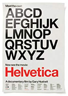
一個字體,一百年的平面設計--Helvetica
演員: Manfred Schulz Massimo Vignelli Rick Poynor Wim Crouwel Matthew Carter Alfred Hoffmann
传奇字体/海维提卡/传奇字体
導演: Gary Hustwit演員: Manfred Schulz Massimo Vignelli Rick Poynor Wim Crouwel Matthew Carter Alfred Hoffmann
電影評論更多影評

2013-12-30 17:24:28
Helvetica, More than a typeface
不止是字體,更關乎美學、設計,以及個體和社會的關係。
----------------------------------------------------------
We think typography is black and white.
我們以為排印設計就是黑色加白色
Typography is really white, it's not even black.
而排印實際上是白的,而不是黑的
lt is the space between the blacks that really makes it.
因為字體是由黑色形體之間的空間來定義的
ln a sense it's like music,
這有點像音樂
it's not the notes, it's the space you put between the notes that makes the music.
音樂不是由音符,而是由音符之間的空間來定義的
what it's all about is the interrelationship of the negative shape
我們實際上談論的是它們與其「負形」之間的相互關係
the figure-ground relationship,
實體與空間之間的關係
the shapes between characters and within characters,
字體內部,以及字體之間的空間形態
with the black if you like, with the inked surface.
以及黑色部份,如果你喜歡這樣稱呼的話;和過墨的部份
And the Swiss pay more attention to the background,
而瑞士人更關注於字體的負形
so that the counters and the space
between characters just hold the letters.
所以字谷與字形間的空間就把整個字母固定住了
l mean you can't imagine anything moving;
你看不出絲毫的「鬆動」
it is so firm.
它就是如此的「結實」
lt's not a letter that's bent to shape;
這不是一套彎曲成形的字體
it's a letter that lives in a powerful matrix of surrounding space.
每一個字母實際上是存在於一個強有力的矩陣所包圍著的空間
lt's . . . oh it's brilliant when it's done well.
這實在是... 太出色了,當所有的一切完成之後
Helvetica was a real step from the nineteenth-century typefaces.
相對於19世紀的那些字體,Helvetica 是一個非常重要的突破
lt was a little more machined,
稍微有一點機械的味道
it was doing away with these manual details in it,
沒有太多人工的痕跡
and we were impressed by that, because it was more neutral.
它給我們留下很深的印象,因為它更為「中性」
And neutralism was a word that we loved.
而中立主義,是我們喜愛的一個字眼
it shouldn't have a meaning in itself. lt should . . .
它本身不應該包含任何含義,它應該...
the meaning is in the content of the text, not in the typeface.
含義應該來自於文本的內容中,而非字體的表象
Governments and corporations love Helvetica
政府和企業喜歡 Helvetica
because on one hand it makes them seem neutral and efficient,
因為一方面它令他們看上去中立和有效率
but also the smoothness of the letters
makes them seem almost human.
柔和的字形也讓他們看起來更人性化
That is a quality they all want to convey
這一直是他們試圖傳達的質素
because of course they have the image they are always fighting
因為他們一直想改變他們的形象:
that they are authoritarian they're bureaucratic,
獨斷、官僚、
you lose yourself in them, they're oppressive.
讓人失去理性、壓迫
So instead, by using Helvetica
然而,改用 Helvetica
they can come off seeming more accessible, transparent, and accountable,
就可以使他們看起來親切、透明、可靠
American Apparel uses Helvetica and it looks cheeky.
美國服飾 用Helvetica 顯出隨意
American Airlines uses it and it looks sober.
而美國航空 用 Helvetica 顯出穩重
And it's not just a matter of the weight they use and the letter spacing and the colors.
這不僅僅因為他們所使用的字重,字距,和顏色
There's something about the typeface l think
really invites this sort of open interpretation.
還因為字體本身就支持開放性的釋讀
Why do people buy certain things? The brand rubs off on them.
為什麼人們固定地購買某些東西?品牌消減了人們的選擇面
And typefaces are a brand.
字體也是一個品牌
You're telling an audience, This is for you,
by using a certain typographic voice.
你用一種特定的"字體排印的聲音"告訴"聽眾",這是屬於你們的
ln a way, Helvetica is a club. lt's a mark of membership;
從某種角度說,Helvetica 就是一個俱樂部,一種會員資格的標記
it's a badge that says we're part of modern society,
它是一個徽章,昭示則我們是現代社會的一份子
we share the same ideals.
我們有著共同的理想
lt's well-rounded, it's not going to be damaging or dangerous.
它方圓周正,不會給人帶來破壞和危險的感覺
Helvetica has almost like a perfect balance of push and pull in its letters,
Helvetica 的字母中有著一種近乎完美的收與放的平衡
By the time I started as a designer, it sort
of seemed there was only one trick in town,
當我開始成為一個設計師的時候,這個行業的唯一「技巧」
which was like, what can you use instead of Helvetica.
大概就是,除了Helvetica,你還能用什麼?
it seemed like Helvetica had just been used so much and overused so much
我覺得 Helvetica 被廣泛地和過度的濫用了
and associated with so many big, faceless things
並且總是與如此眾多巨大的、面無表情的事物關聯在一起
that it had lost all its capacity even, to my eyes at least, to look nice.
它已經失去了那種令人賞心悅目的能力,至少對我而言
And by the seventies, especially in America,
在70年代,特別是美國
you start to get a reaction against,
人們開始採取行動反抗
what it seems to those designers is the conformity,
那些千篇一律的設計風格
And when I walked into design as a student at Tyler School of Art,
當我作為 泰勒藝術學校的學生,進入設計領域時
what struck me was sort of two separate cultures of design.
兩種截然不同的設計文化給我很大的衝擊
One was the corporate culture,
一種是公司文化
and the corporate culture was the visual language of big corporations,
公司文化指的是大公司的視覺語言
and at that time they were persuasively Helvetica.
那個時候的公司文化毫無疑問地是 Helvetica
They looked alike, they looked a little fascistic to me.
它們看上去很相似,在我看來有點法西斯
And so ln the Postmodern period, designers were breaking things up.
在後現代時期,設計師們打破一切規矩
They wanted to get away from the orderly, clean, smooth surface of design
他們希望遠離有序、乾淨、柔順的設計
the horrible slickness of it all, as they saw it
遠離他們所見的一切恐怖的匠氣的東西
and produce something that had vitality.
創造出具有生命活力的作品
ln the '70s, the young generation was after psychedelic type,
70年代,年輕的一代都喜歡追逐迷幻劑一樣的字體
They didn't know what they were caring for,
他們不知道他們在乎什麼
they only knew about what they were against.
他們只知道他們要反對什麼
And what they were against was Helvetica.
他們要反對的就是 Helvetica
If you are not a good designer, or if you are not a designer,
如果你不是個好的設計師,或者你本來就不是設計師
just use Helvetica Bold in one size,
用固定字號的 Helvetica 粗體就是了
like for a flyer. . . it looks good.
比如用在宣傳單頁上...它就會... 很好看
So it may very well be that when it comes to trends,
很可能,至少在平面設計的潮流上
at least in graphic design, we've reached sort of the end of history.
我們已經抵達了歷史的終點
The pendulum that swings back and forth
doesn't have any more directions it can swing in.
鐘擺往復運動,不會再擺向第三個方向
The final trend may simply be the completely
democratic distribution of the means of production
最終的潮流可能就是生產方式完全為大眾所用
to anyone who wants it or anyone who can afford it.
每個希望能擁有的人,每個負擔得起的人都能得到
It's always changing, time is changing,
世界永遠在變,時代在變
the appreciation of typefaces is changing very much.
對字體的欣賞也在發生很大的改變
You are always child of your time, and you cannot step out of that.
人永遠都是時代的孩子,無法跳出你所處的時代
評論

