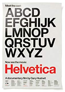
電影訊息
一個字體,一百年的平面設計--Helvetica
演員: Manfred Schulz Massimo Vignelli Rick Poynor Wim Crouwel Matthew Carter Alfred Hoffmann
传奇字体/海维提卡/传奇字体
導演: Gary Hustwit演員: Manfred Schulz Massimo Vignelli Rick Poynor Wim Crouwel Matthew Carter Alfred Hoffmann
電影評論更多影評

2013-06-11 21:04:21
Helvetica
以下筆記+雜感
A designer's life is a life of fight. A fight against ugliness.just like doctors fight against diseases, for us, the visual disease is what we have around. What we are to do is to cure it somehow, with design.
Helvetica:
post war atmosphere, rational, neutral , clear, shared sense of responsibility of of designer around the world. Modern,clear.
It lives in the background. It's firmly surrounded by by background.
The government likes it because its smoothness makes it look humane, efficient and clean.
Designers cannot seen historical documentaries because the font always look wrong. Hahhaha.
Well-rounded , balanced, contained. Order , discipline
Public area, look serious, tell you what to what not to do.
1970: conformity, routine, sameness. ... Fascism , big cooperative , commanding supports Vietnam war.authoritativez
Standard
Typo needs vitality , breaks away from rule. Expresses designer's own sensitivity .
Post modernism by 1989 grunge period all crazy chaotic, needs to go back.
Today , Helvetica, is not scary, we can accept it not obsessed about it. Always keeping adventure can be exhausting. using helvetica is not superficial, people can adjust to it. People can still be different under Helvetica . Helvetica is not a globalization monster.
電影太妙了。通過人們對helvetica三次態度變化反射出了社會,設計,潮流變化。提出了盲從,排斥與適應三種面對的方式。同時討論了表達與交流的區別,有的東西可以表達得非常清楚,卻沒有起到交流的作用,甚至是錯誤的資訊。而有些模糊難懂的資訊卻可能表達完全不同的資訊,它雖然需要讀者更多的努力,卻能表達出最精準的資訊。Don't confuse legibility with communication. Just because something is legible doesn't mean it's legible . 同時也讓我想起在coursera上看到關於繪畫潮流的演變。也是戰後有了modernism在反對之前的表達形式, 雖然是不同的藝術表現形式,卻又同樣的標化趨勢,非常有趣的發現。
在談到80年代設計師抵制helvetica,創造垃圾字體時,從50年代modernism走過的老設計師說:「這些年輕人都瘋狂了,只知道反對一切,卻不知道自己支持什麼。」這話說給身邊的憤青聽一聽也不為過。
設計師真是可愛的人啊哈哈。有一則笑話說,設計師們不能看歷史紀錄片, 因為裡面的字體總看著不舒服。片中的設計師還認真地說:「這是真的!」。
總體非常thought-provoking,值得多看幾遍。
評論

